The biggest paint brands in the U.S. have dropped their 2026 Color of the Year picks — and the verdict is in: comfort, nostalgia, and nature are back in full force.
From grounding neutrals to rich, moody tones, the colors of 2026 are about creating spaces that feel lived-in, calming, and connected to the natural world.
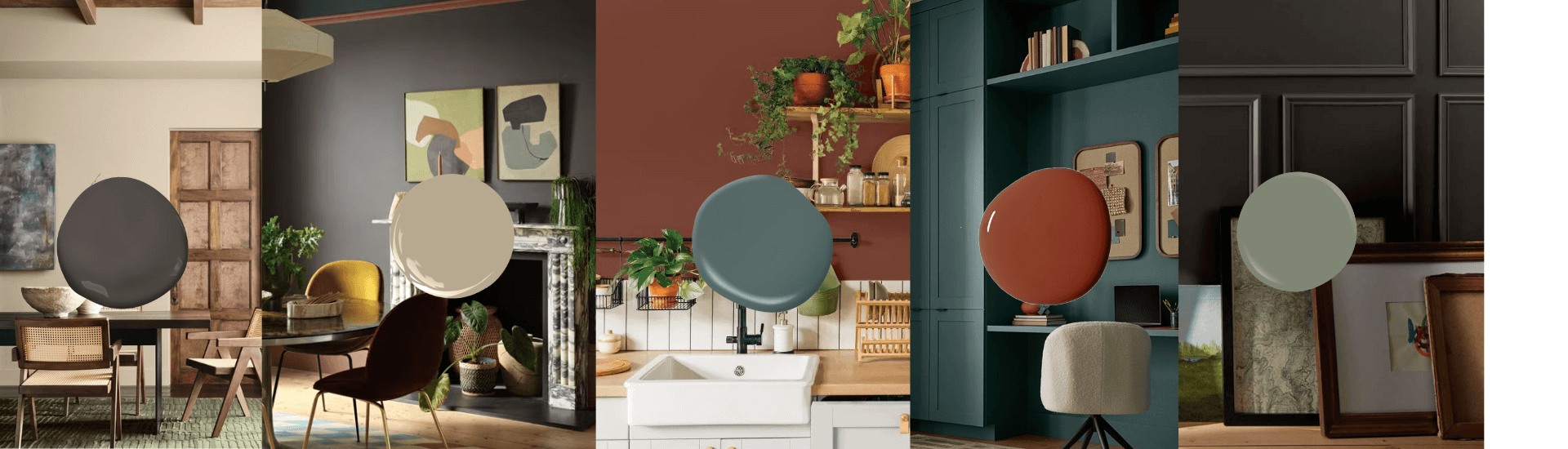
Sherwin-Williams: Universal Khaki — Tailored, Timeless Neutral
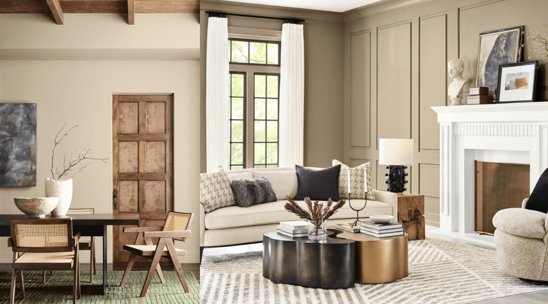
Sherwin-Williams chose Universal Khaki (SW 6150) — a grounded, mid-tone tan that feels timeless yet modern. It’s a shade born from simplicity, celebrating the idea that less truly is more. Warm, sandy, and sophisticated, it’s the color equivalent of quiet luxury.
Use it when: You want your home to feel composed and intentional. Universal Khaki brings warmth without chaos. It’s a perfect anchor for natural woods, soft whites, and black accents.
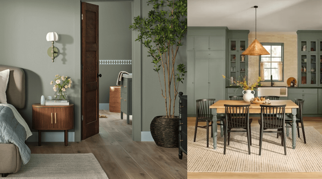
Behr: Hidden Gem — Smoky Jade for Depth and Calm
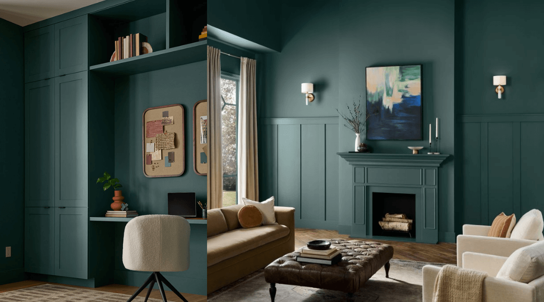 Behr’s 2026 pick, Hidden Gem (N430-6A), is a smoky jade that sits between green and blue — calm but full of life. It’s refined, expressive, and a little mysterious, like ocean water under cloud cover.
Use it when: You want color that feels rich but not loud. Hidden Gem works everywhere — from kitchen cabinets to bedroom walls. It pairs beautifully with brass, cream, and natural stone for a look that’s elevated yet grounded.
Benjamin Moore: Silhouette — Sophisticated Espresso Brown
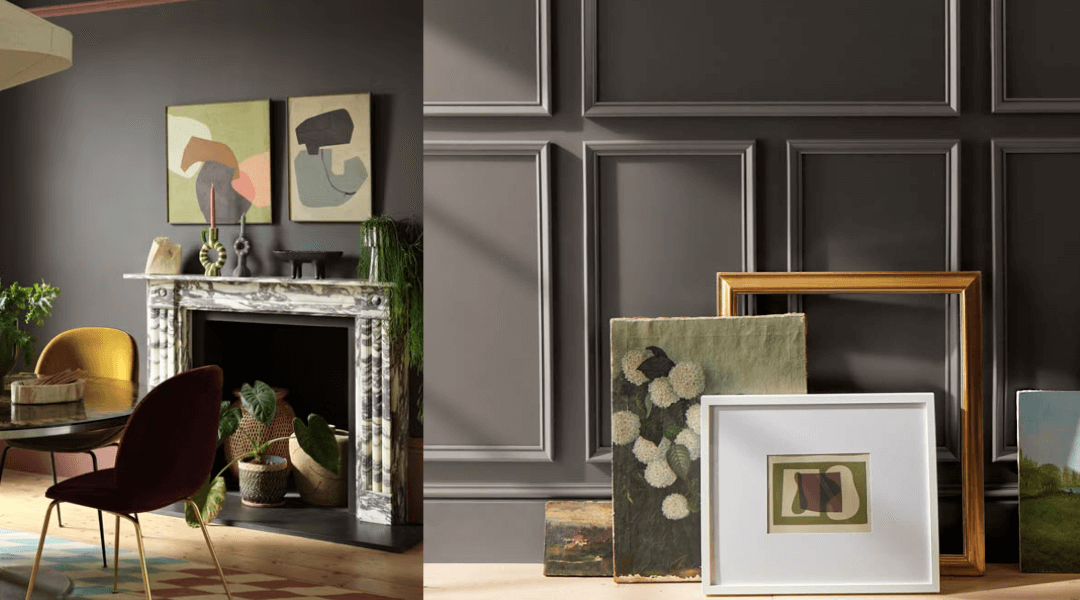 Benjamin Moore crowned Silhouette (AF-655), a deep espresso brown with subtle charcoal undertones. It’s the grown-up evolution of black — softer, more dimensional, and infinitely cozier. Think tailored menswear, fine leather, and candlelight.
Use it when: You want drama without harshness. Silhouette wraps a room in warmth — perfect for dens, offices, or dining spaces. Paired with crisp whites or rich golds, it channels pure quiet luxury.
Valspar: Warm Eucalyptus — Serene Vintage Green
 Valspar’s Warm Eucalyptus (8004-28F) is a naturally restorative, sage-green neutral that blurs the line between retro and modern. It feels nostalgic, but fresh. Cozy, but chic.
Use it when: You want calm energy that still has personality. This hue shines in bedrooms, living rooms, and bathrooms, especially alongside wood, linen, and rattan textures. It’s earthy elegance, simplified.
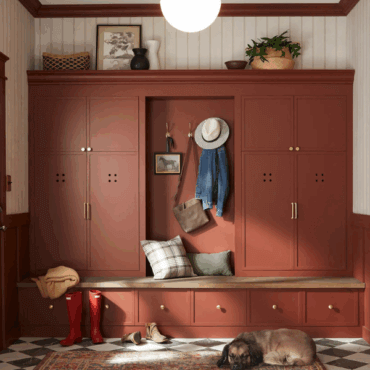
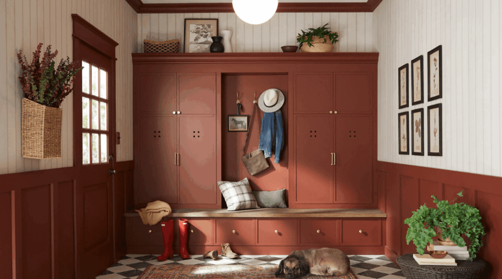
Glidden: Warm Mahogany — Rich Heritage Red
 Glidden’s Warm Mahogany (PPG1060-7) brings passion back to the palette. This deep, red-brown tone nods to heritage interiors and vintage style — it’s bold, confident, and timelessly cool.
Use it when: You want your space to feel intimate, moody, and memorable. Use Warm Mahogany for color-drenched dining rooms, rich accent walls, or cabinetry that makes a statement. It’s cozy and cinematic, but never loud.
The 2026 Mood: Real, Rooted, and Ready for Color
Here’s what ties every pick together:
- Earth over artificial. Every brand leaned into colors that feel organic, tactile, and real. Greens, browns, and reds inspired by soil, leaves, and clay dominate the 2026 palette.
- Timelessness > trendiness. These aren’t colors meant to shock. They’re meant to stay. 2026 is all about hues that age well and adapt with changing styles.
- Comfort is the new luxury. The goal isn’t sterile perfection. It’s warmth, depth, and authenticity. Spaces that feel personal, not staged.
- Neutral redefined. Sage greens, warm reds, and espresso browns are the new neutrals. Versatile enough to carry a whole room or mix with statement pieces.
In 2026, color isn’t about following a rulebook. It’s about feeling something.
Go warmer. Go richer. Go real.