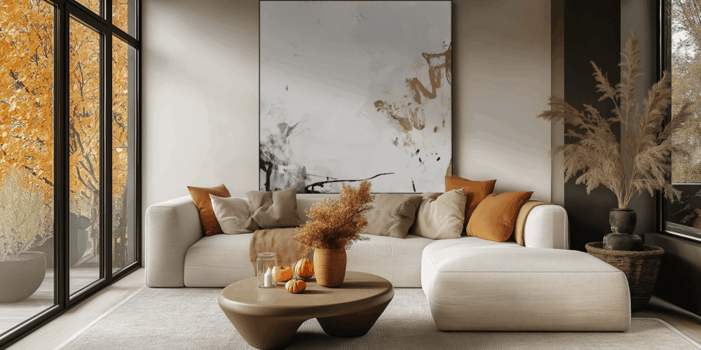
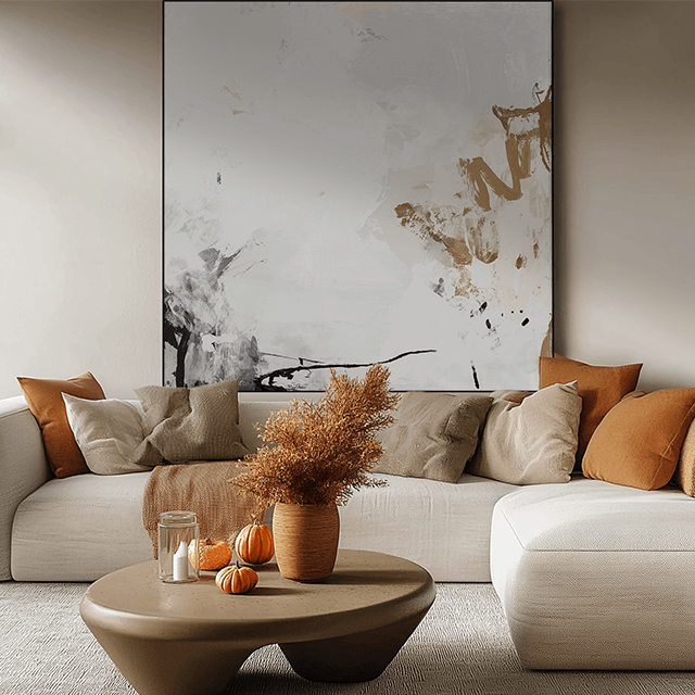
Fall 2025 is warm, grounded, and rich. Earth-tone living rooms: camel, sand, terracotta, muted greens, coppery browns are replacing cold grays and stark whites. The palette feels lived-in and luxe, like a cashmere throw for your walls. It flatters natural materials (walnut, oak, travertine) and makes oversized wall art look intentional, not loud. If you’re hunting for fall wall decor or fall living room decor ideas, start here: go bigger on scale, deeper on color, and smarter on texture.
Why Warm Neutrals Work
Warm neutrals are the universal adapter of interiors. They play nice with modern, transitional, Scandinavian, Mediterranean. They add instant depth without stealing attention from your focal piece. They’re also hyper-practical for real life: fewer scuffs showing, easier touch-ups, and they age better than trend-of-the-week pastels. The bonus? This palette reads “quiet luxury” without the quiet budget. Edit your accents, invest in one oversized print, and the space looks curated, not crowded.
Color psychology helps, too. Camels and sands calm a room; terracotta and rust warm it up; muted greens ground it (thank you, nature). Copper and walnut add the “expensive” undertone people feel before they can name it. In other words: you get cozy energy, grown-up polish, and a perfect backdrop for art that actually carries the room.
How to Nail the Look (copy these formulas)

Camel + Terracotta + Black
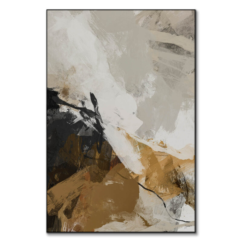
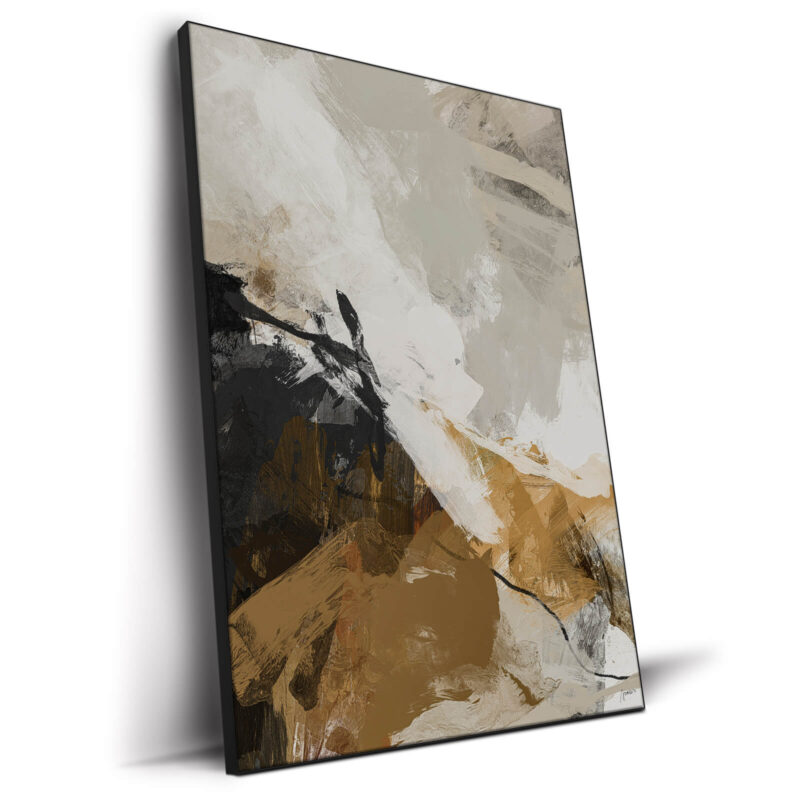
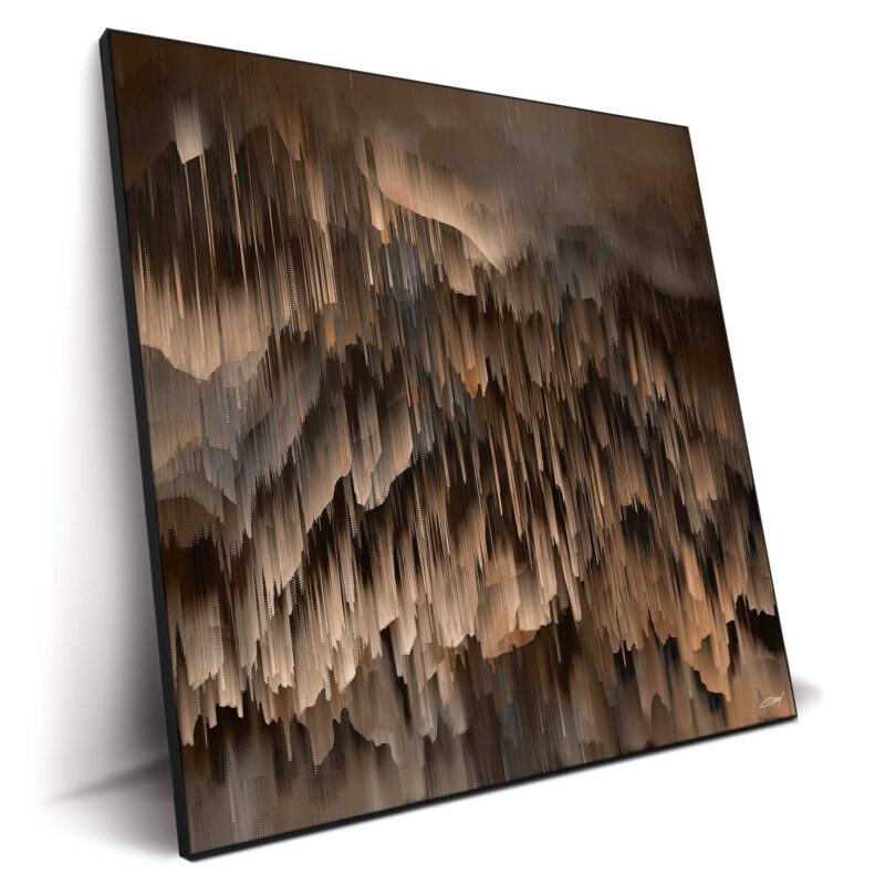
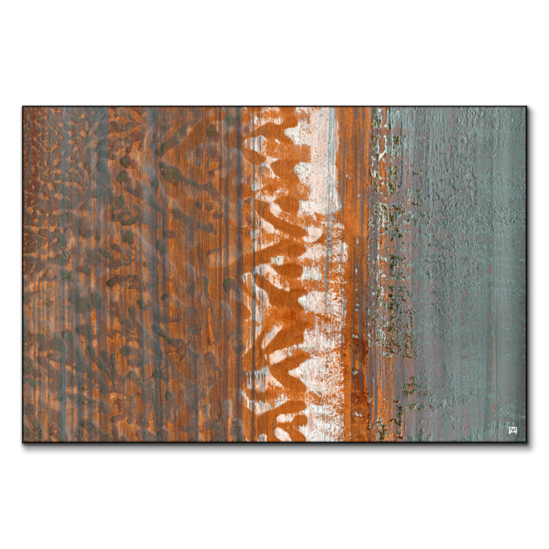
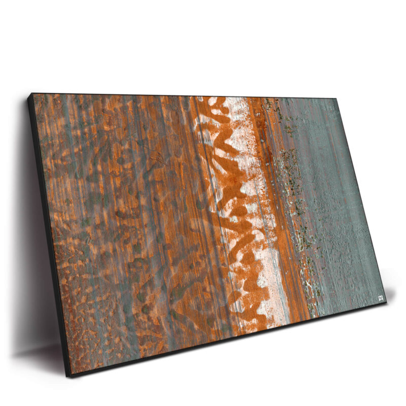
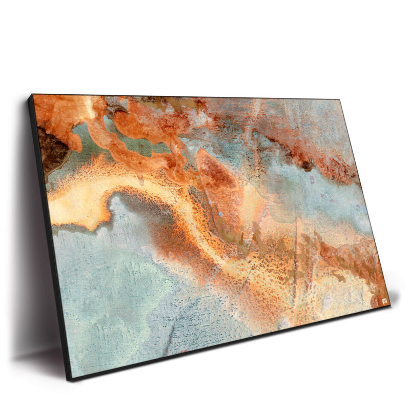
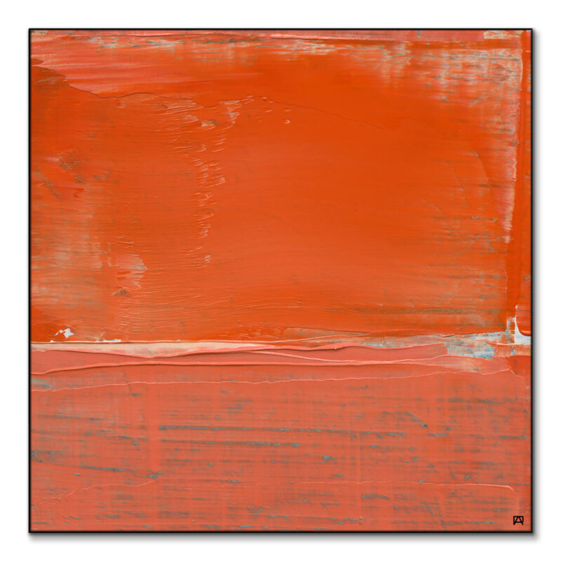
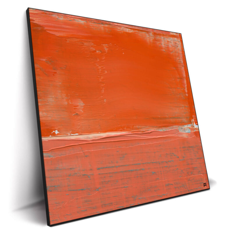
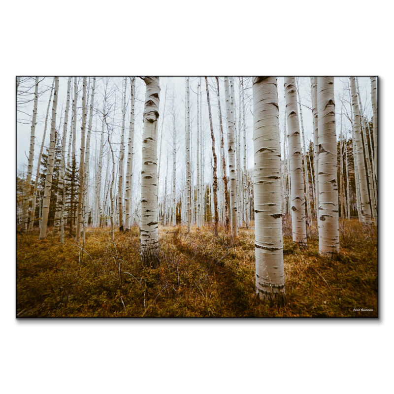
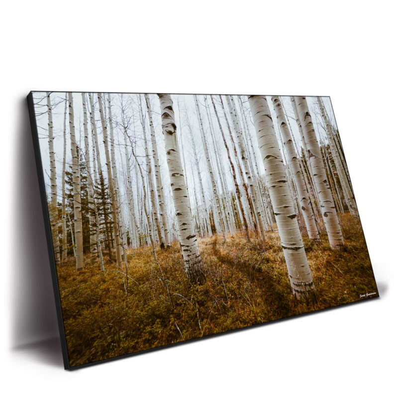
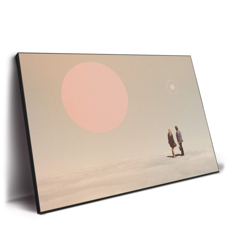
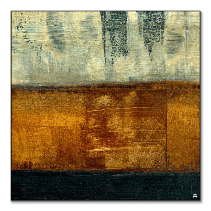
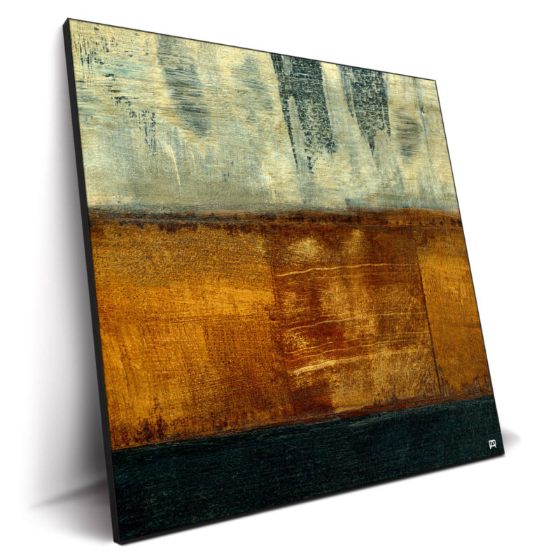
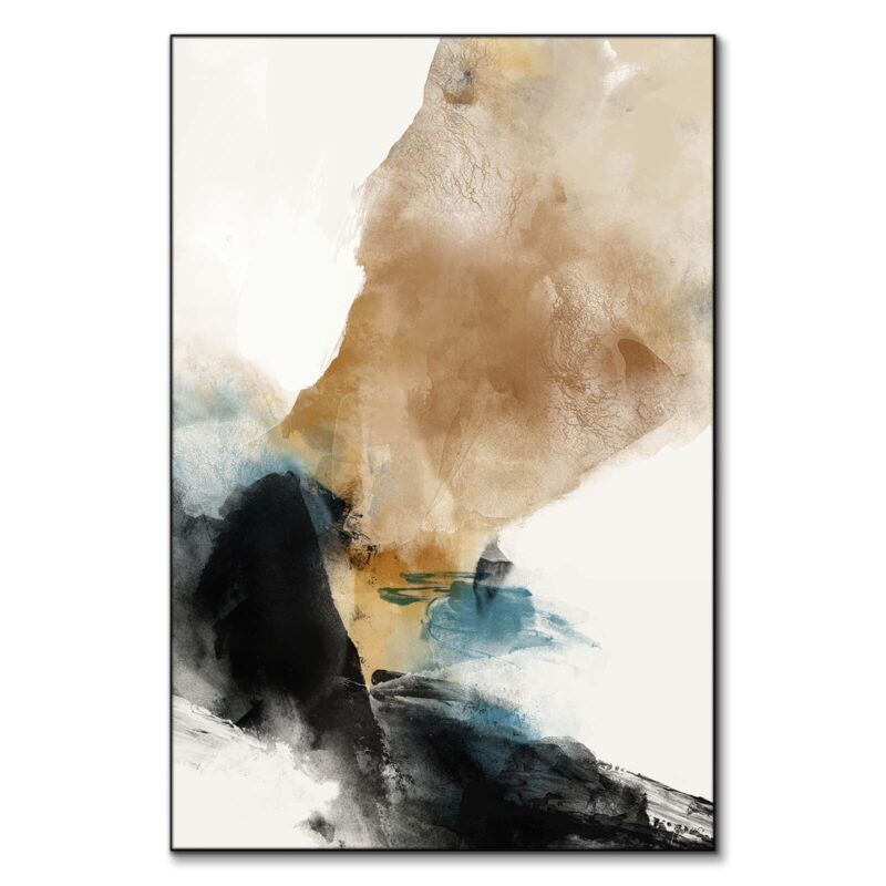
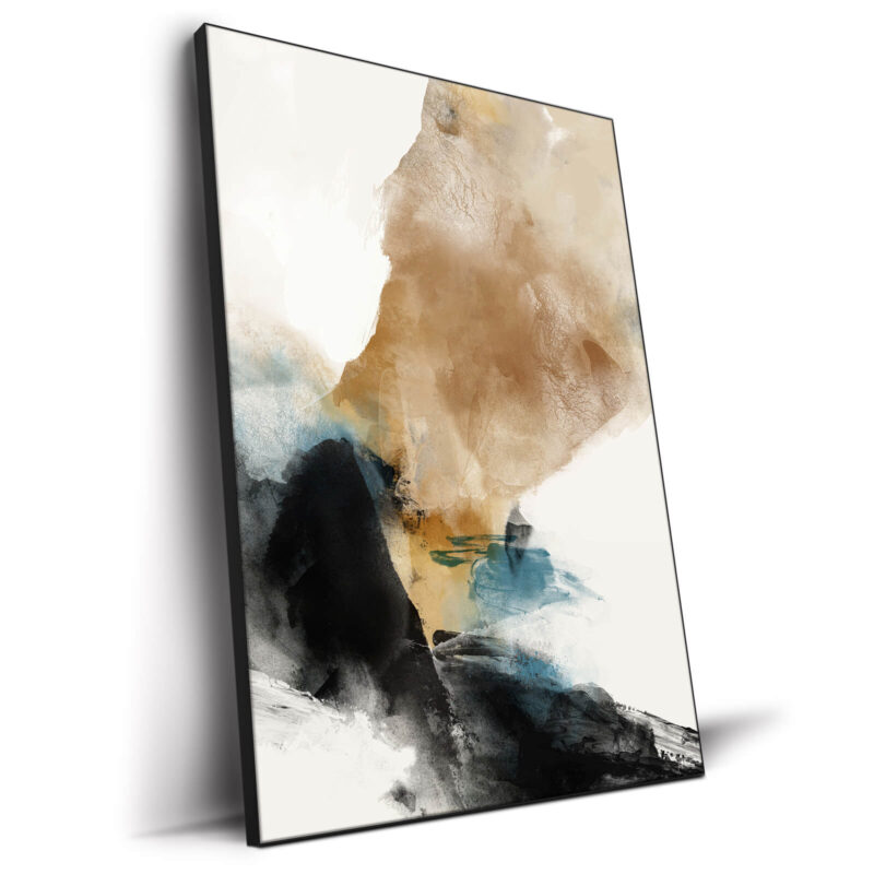
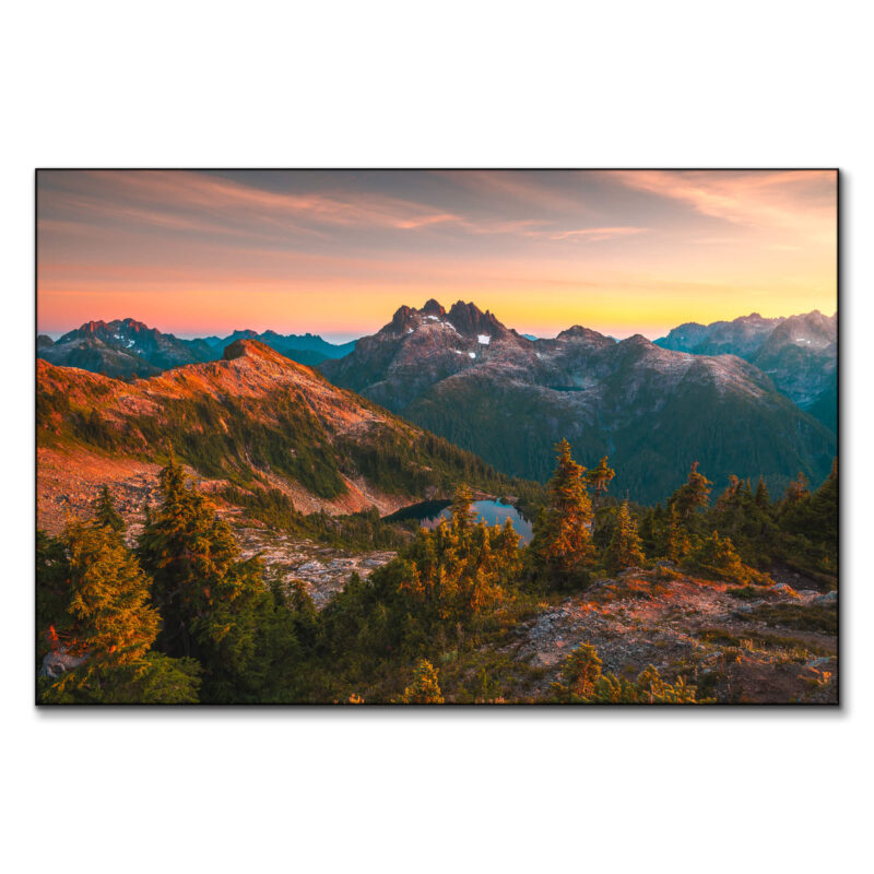
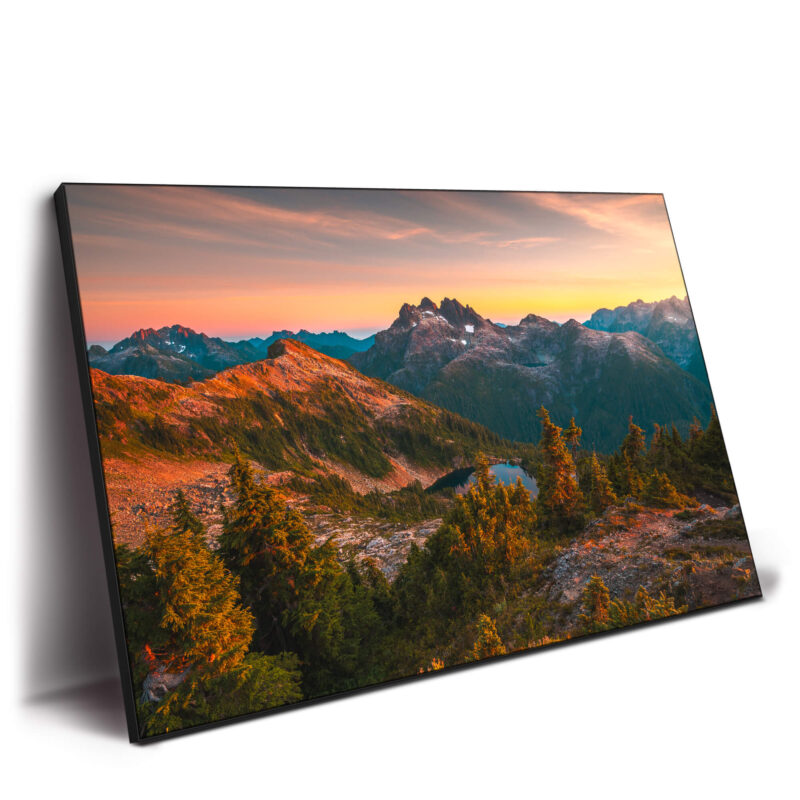
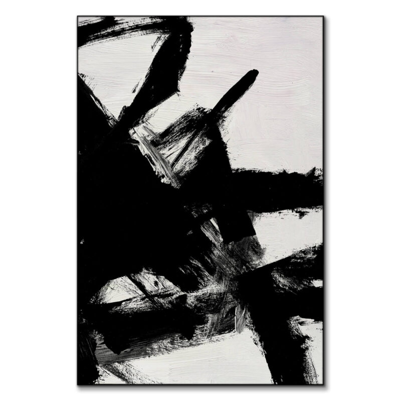
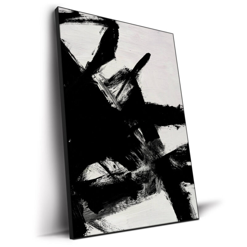
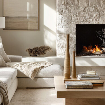
Searches for camel living room and terracotta decor are rising for a reason. Paint a camel wall, layer terracotta pillows/throws, and use matte black for table legs, curtain rods, or a picture light. Then drop a 60×90 hero like Reach the Pinnacle or a 48×48 Brown Stripes. Black gives the edge; terracotta gives the warmth; the big print does the talking.

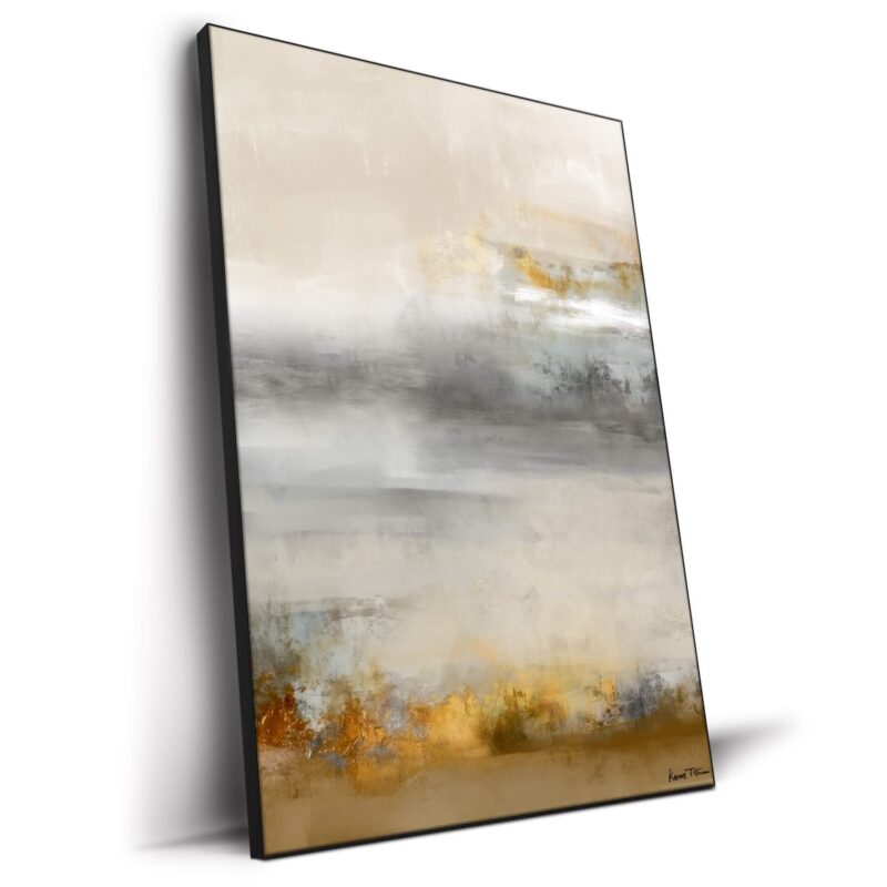
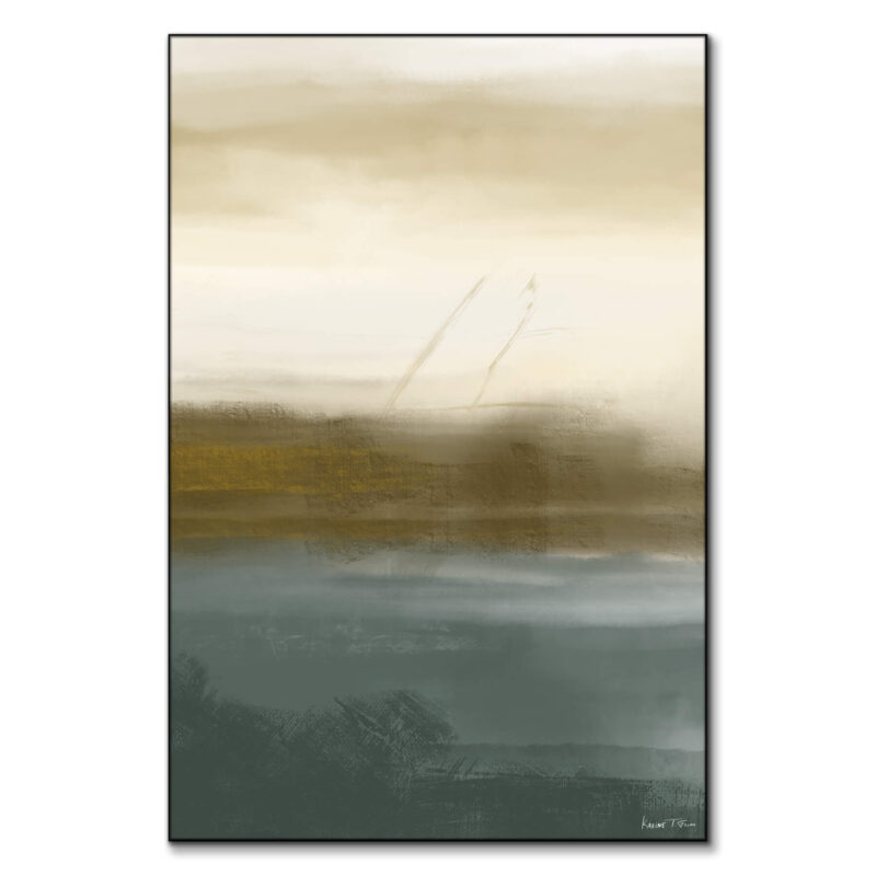
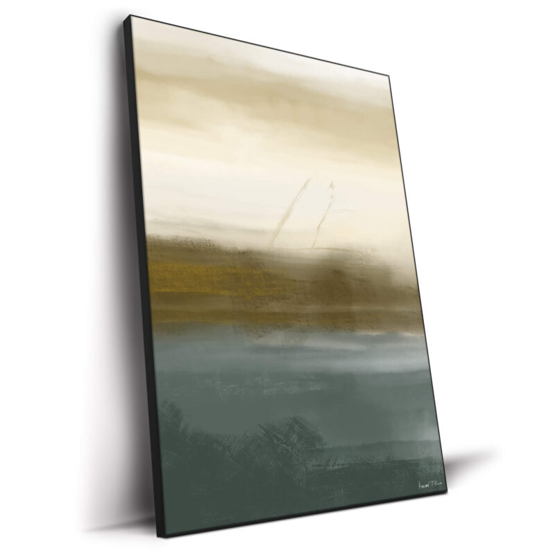
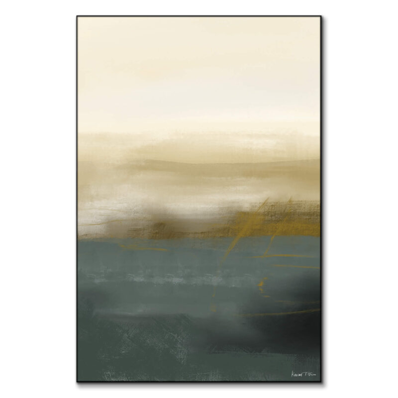
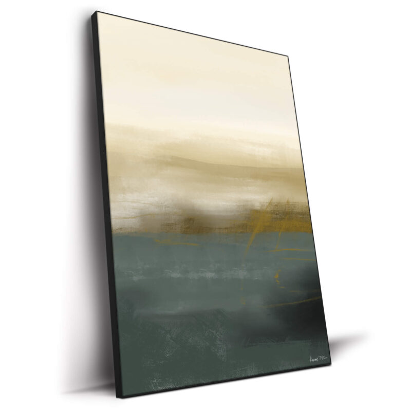
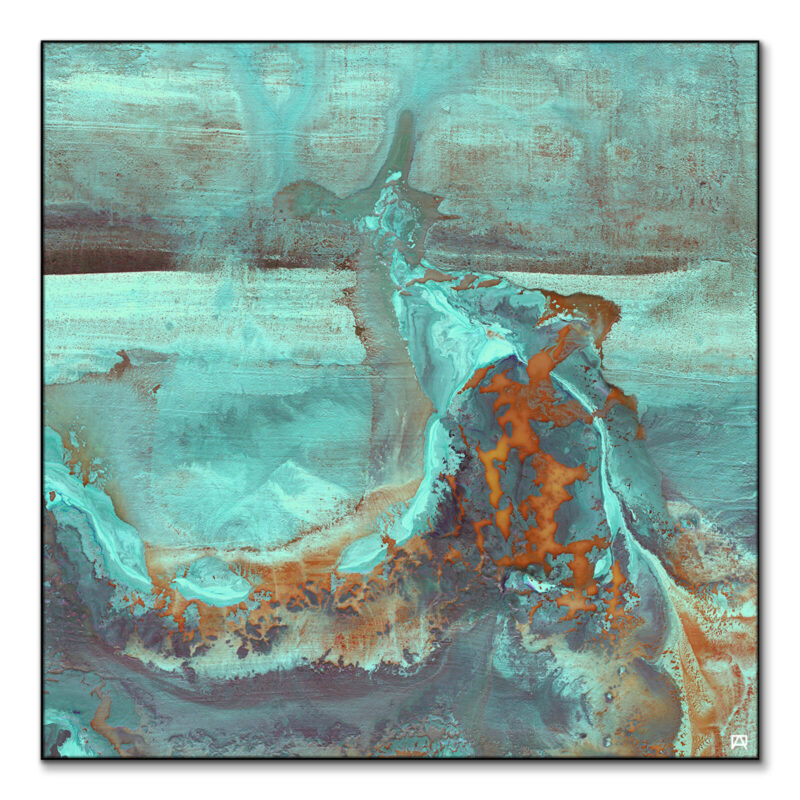
Muted Green (Sage/Olive) + Copper + Cream
This is the soft-lux combo. Try a sage accent wall or limewash, add copper lamps/hardware, and ground the palette with cream boucle or linen. Finish with botanical, landscape, or abstract-nature art like Layers of Life or Teal and Gold. Pro tip: repeat copper twice (lamp + tray) so it looks intentional, not random.

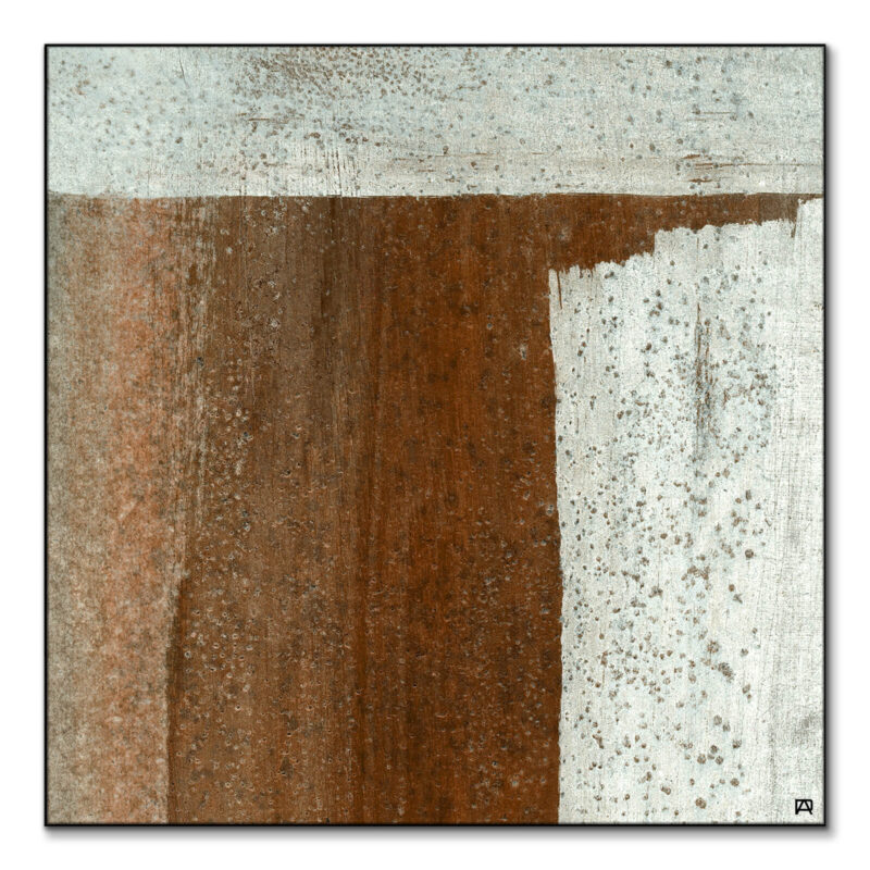
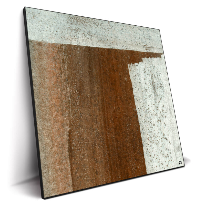
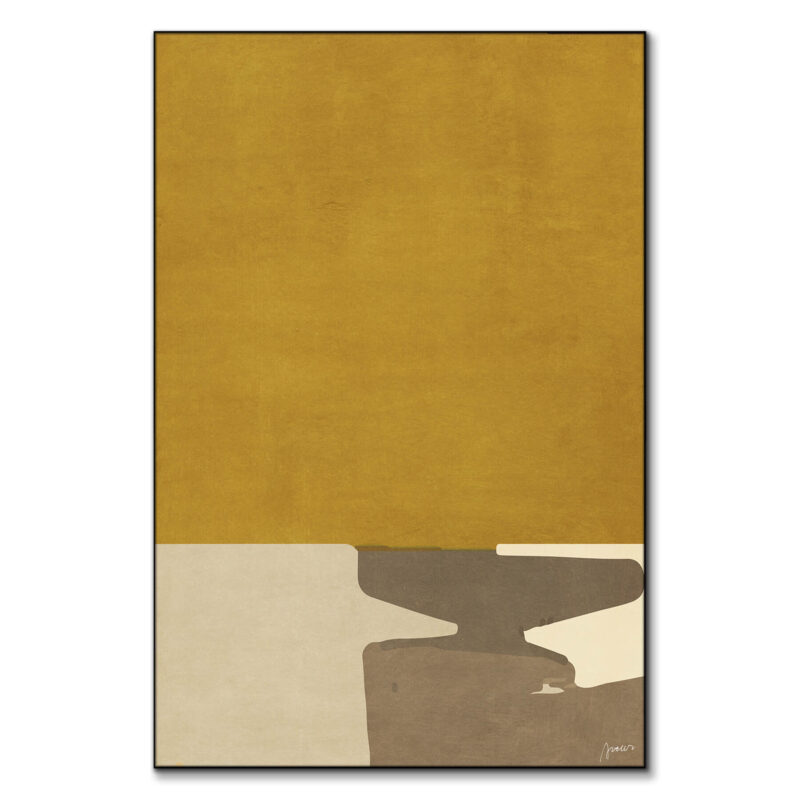
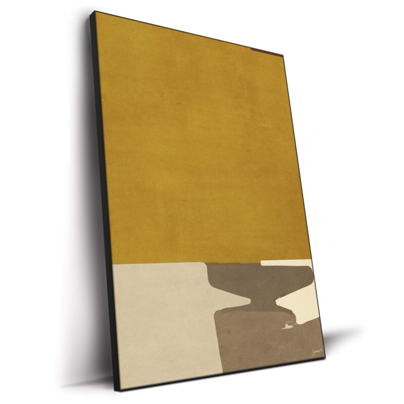
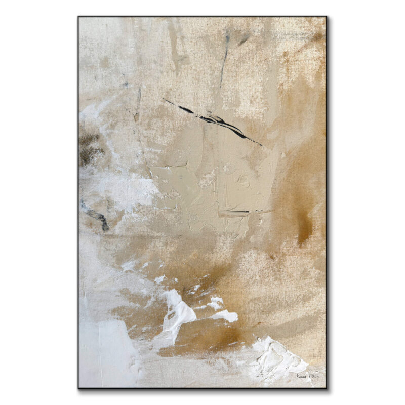
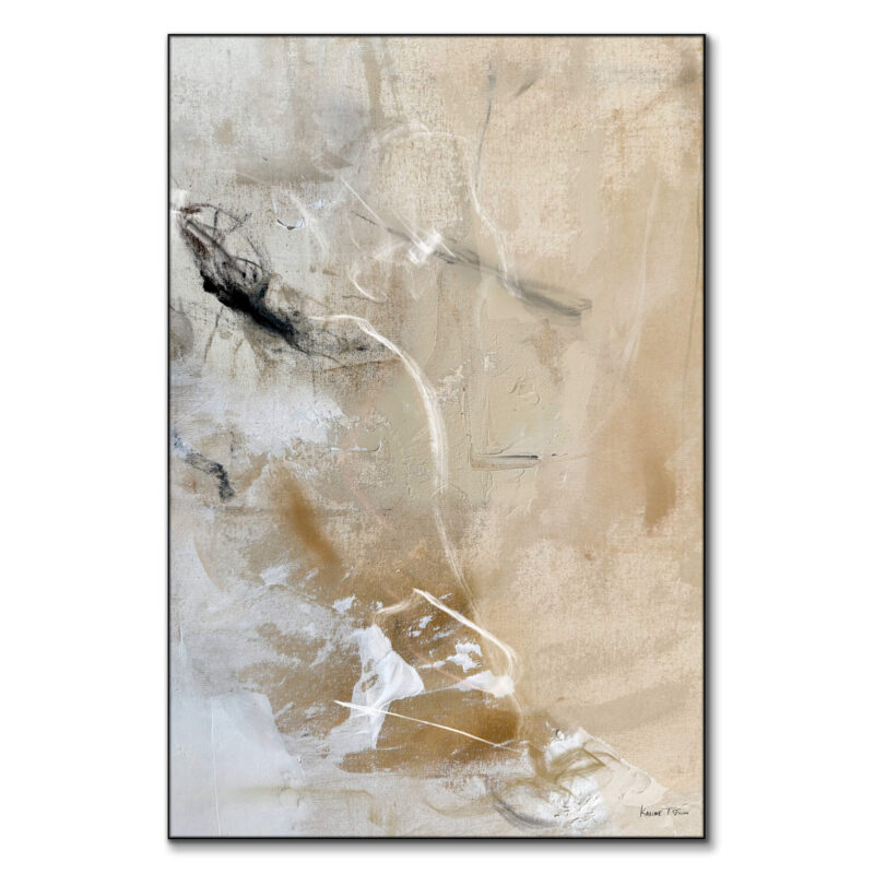
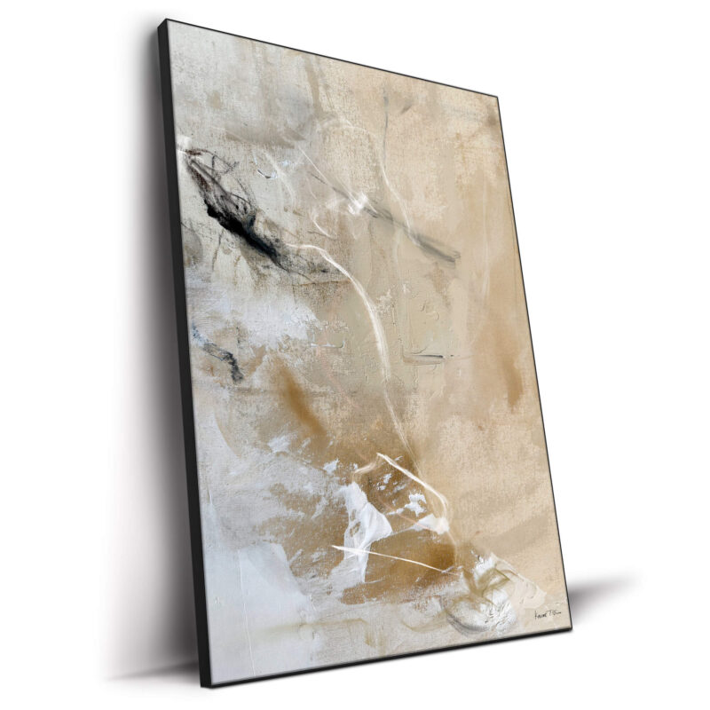
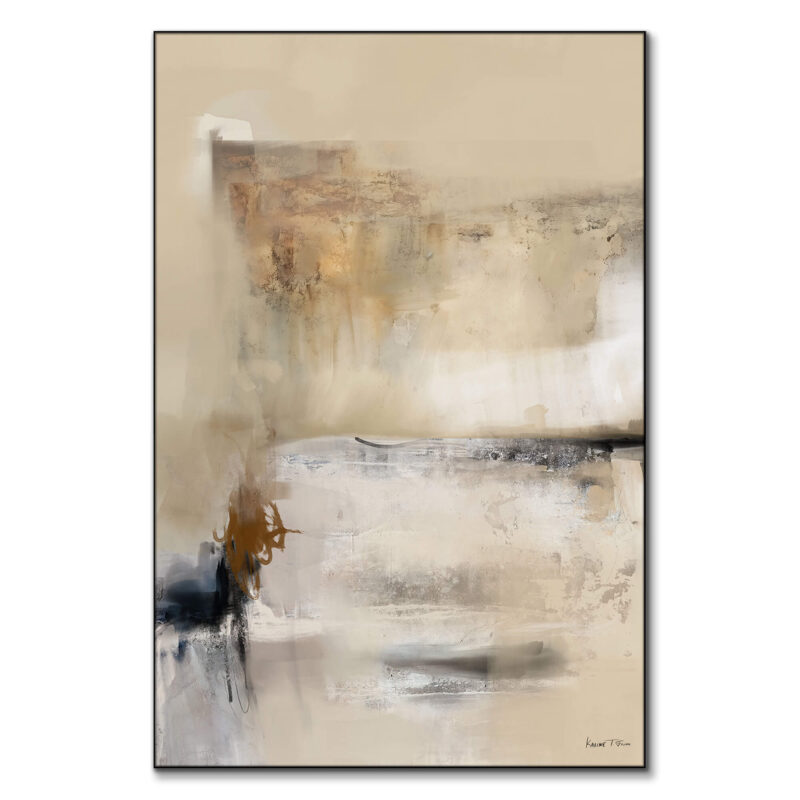
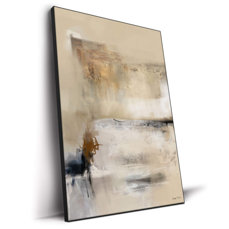
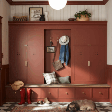
Sand + Rust + Walnut
For the “library at home” vibe. Sand walls, rust velvet cushions, walnut coffee table or media unit. Tie it together with an oversized abstract like Poet on the Mountain. A walnut-toned frame repeats the wood tone, for a fun DIY wood frame look.
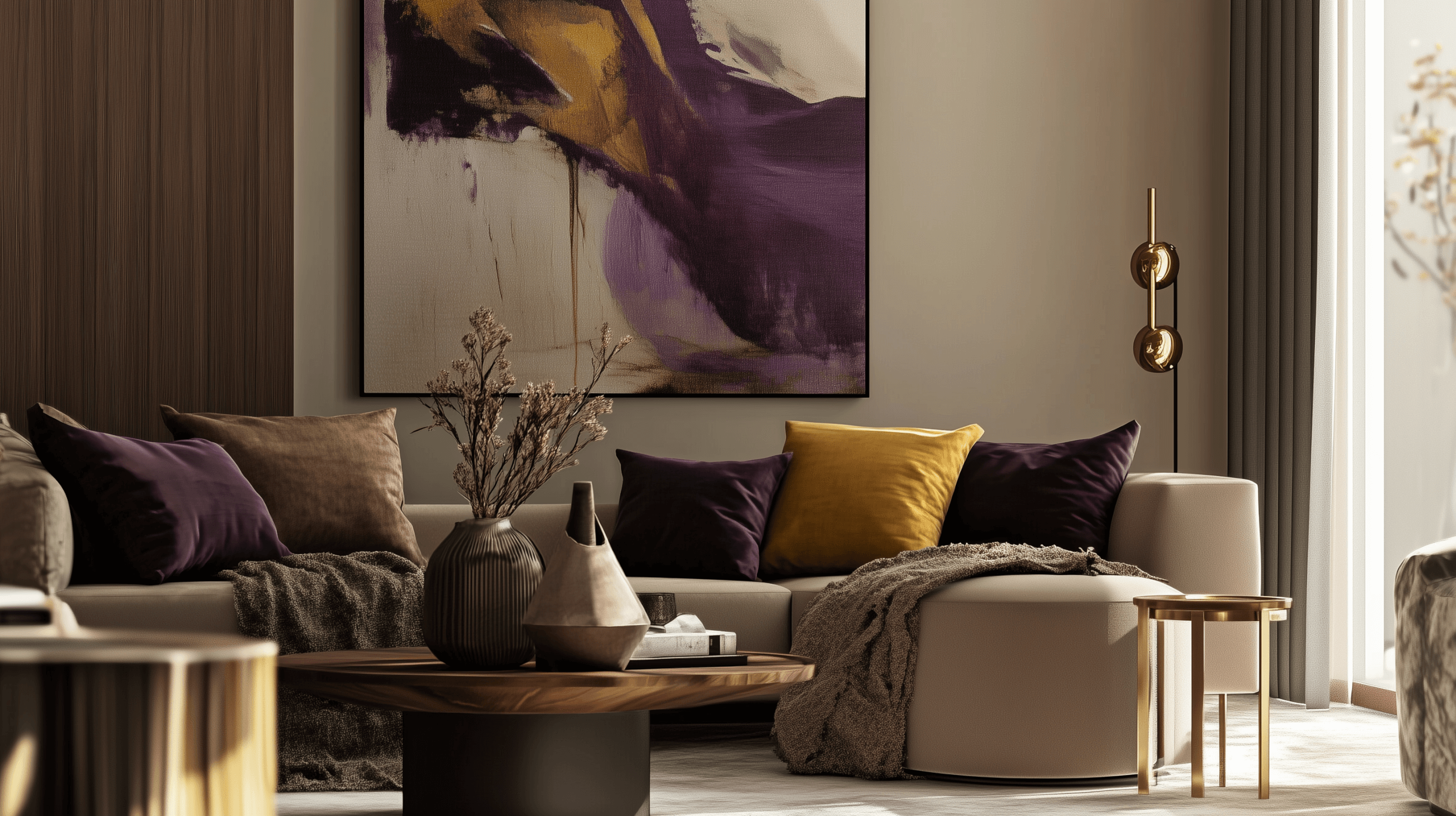
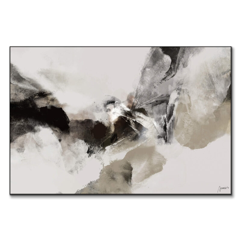
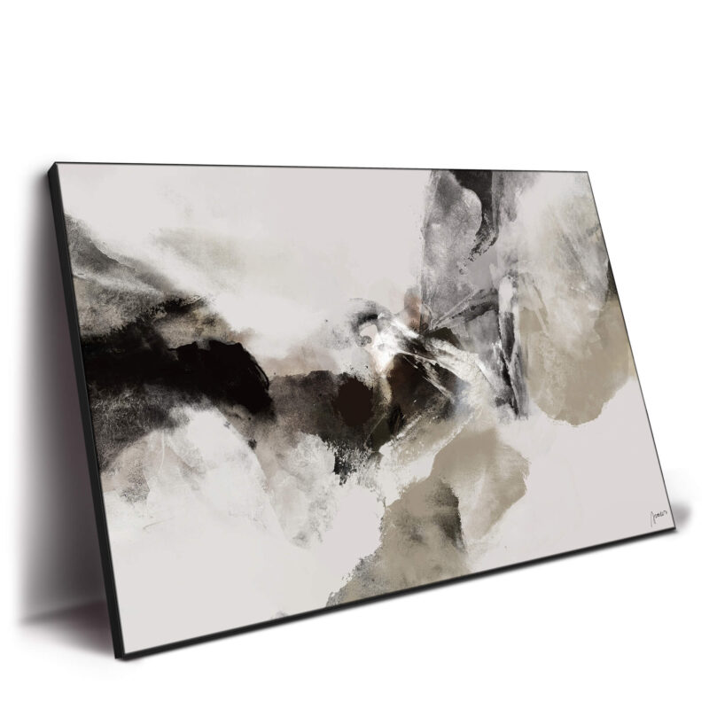
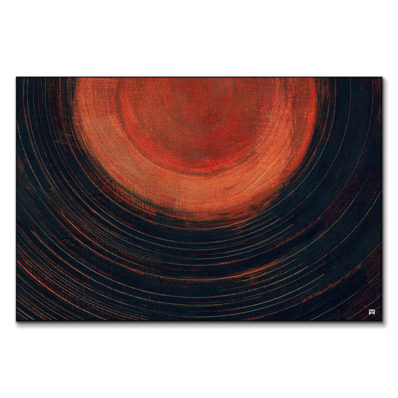
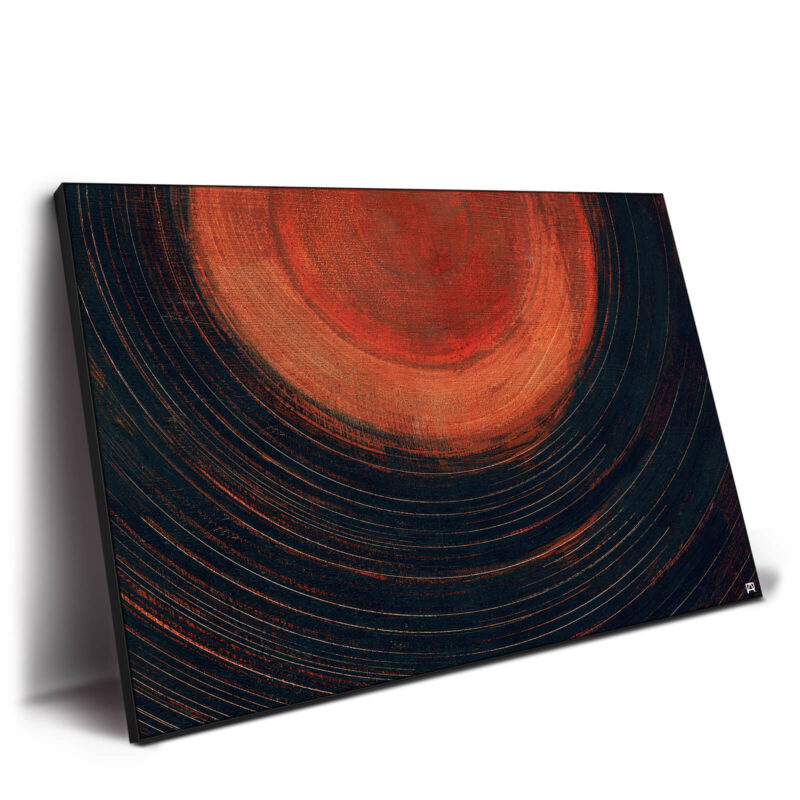
Burgundy + Deep Navy + Oat
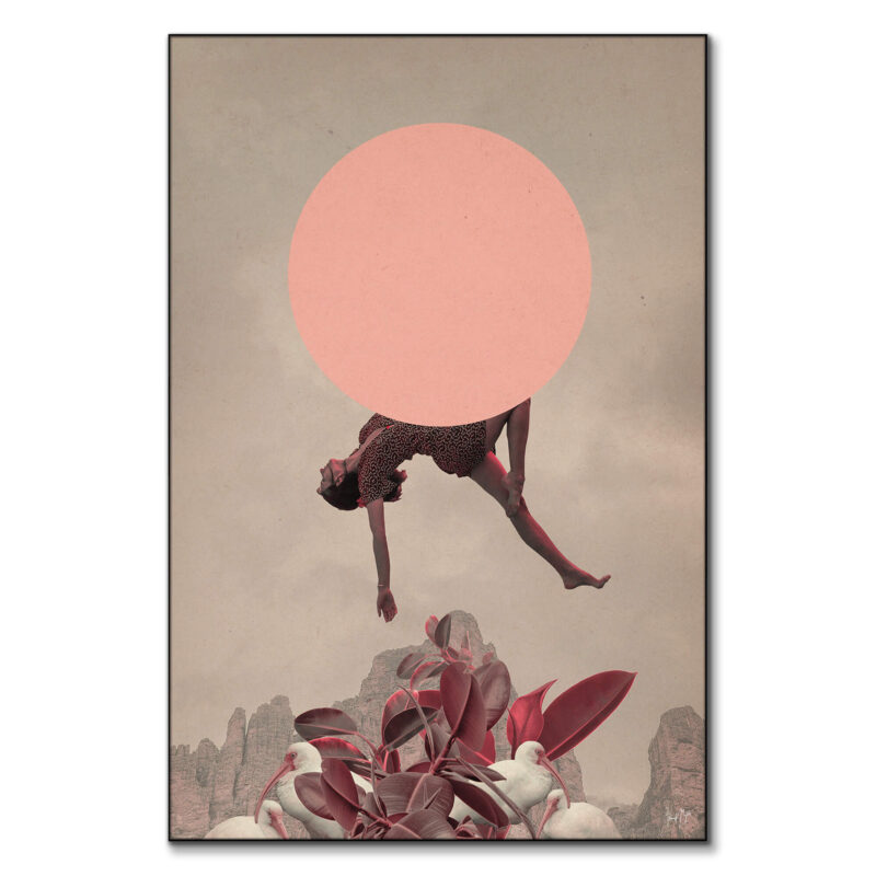
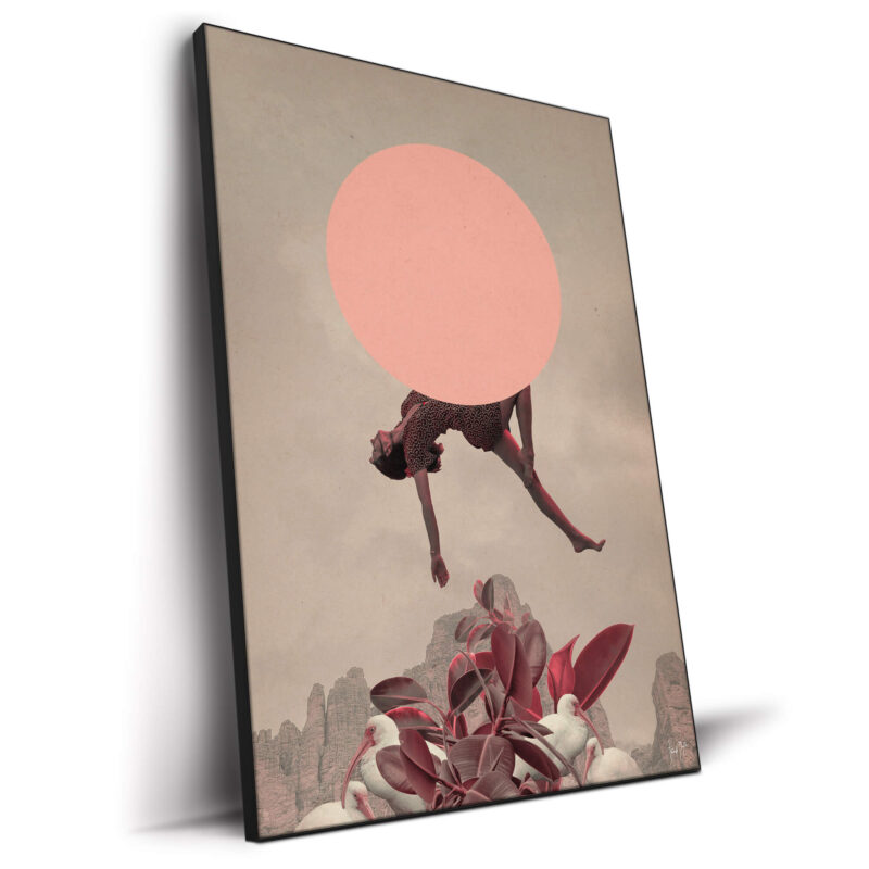
Moody, chic, very fall. Navy upholstery or a rug, burgundy pillows/throw, oat-colored drapes. Add a moody portrait or cityscape like Abstract Interference or Axis Skyline to bring drama without going Halloween. Picture light optional, impact guaranteed.

Caramel + Charcoal + Brass
Slick and modern. Use charcoal for a statement wall or sofa, caramel leather for warmth, and small brass hits (pulls, tray, lamp finial). Anchor with a graphic oversized piece like Abstract Beauty. Layer—Don’t Clutter
Texture is the algorithm hack for interiors. Velvet, boucle, wool, linen, ribbed ceramics, woven grasscloth – layer three to four, max. Keep surfaces edited so the art can lead. Large frames create negative space that reads “gallery,” even in small apartments. If your coffee table is busy, keep the console minimal. If your rug is patterned, let the pillows go solid. Balance > stuff.
Lighting makes or breaks the look. Use three sources: overhead (dimmer), task (table/floor), and accent (picture light or sconce). Warm bulbs (2700–3000K) keep earth tones from going muddy. Aim one light at the art so colors hit their full saturation—your camera roll will thank you.
Keep It Cozy, Not Cliché
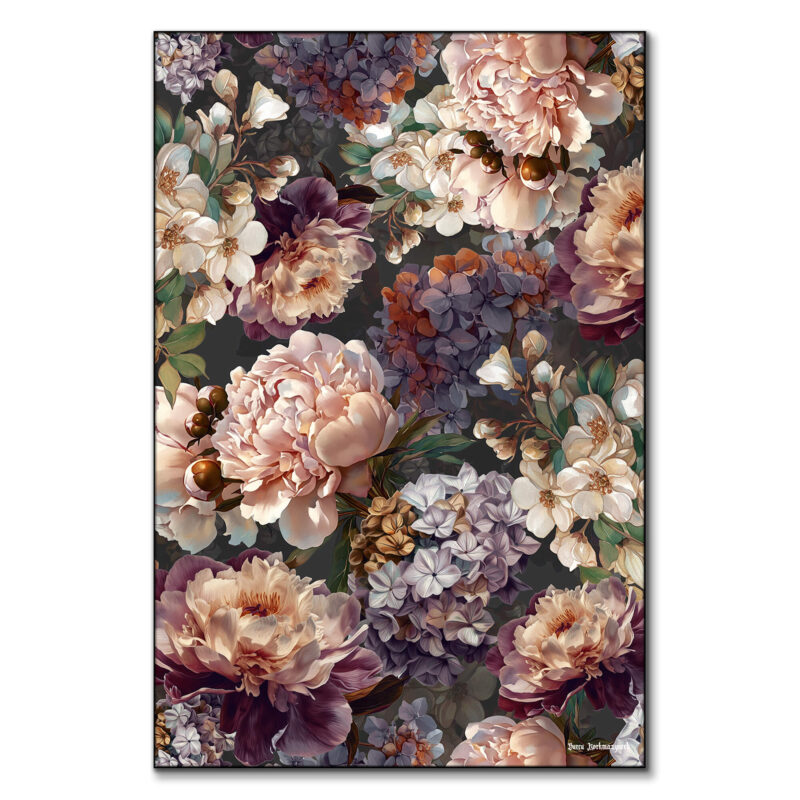
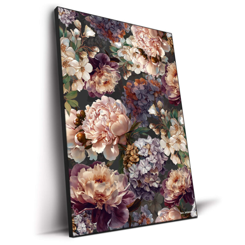
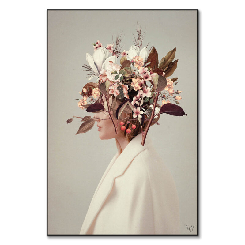
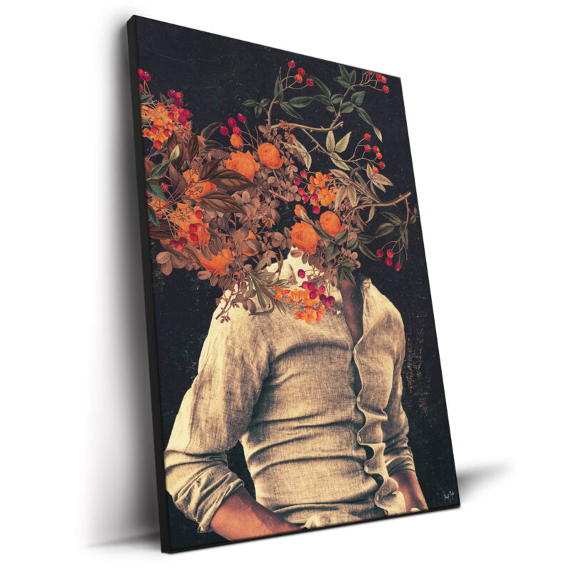
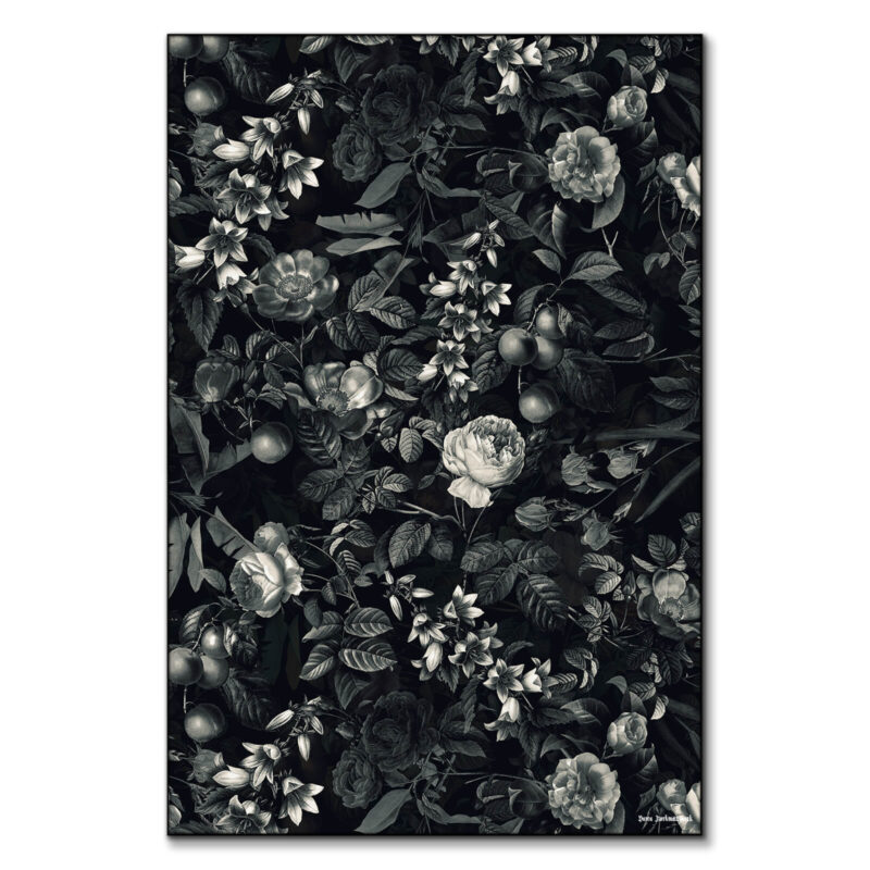
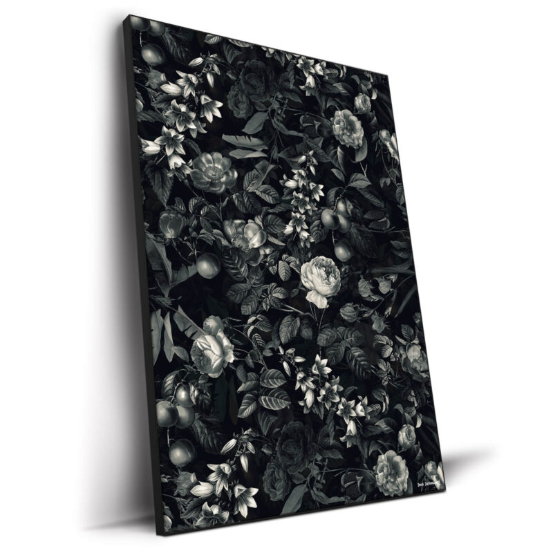
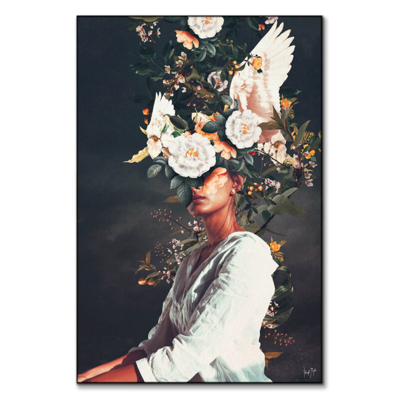
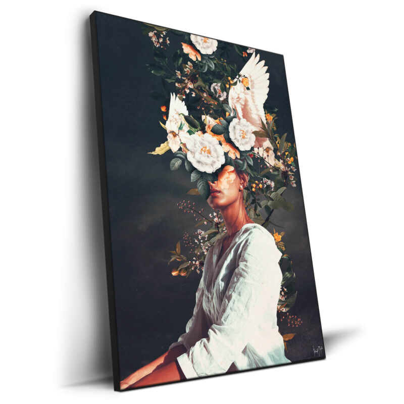
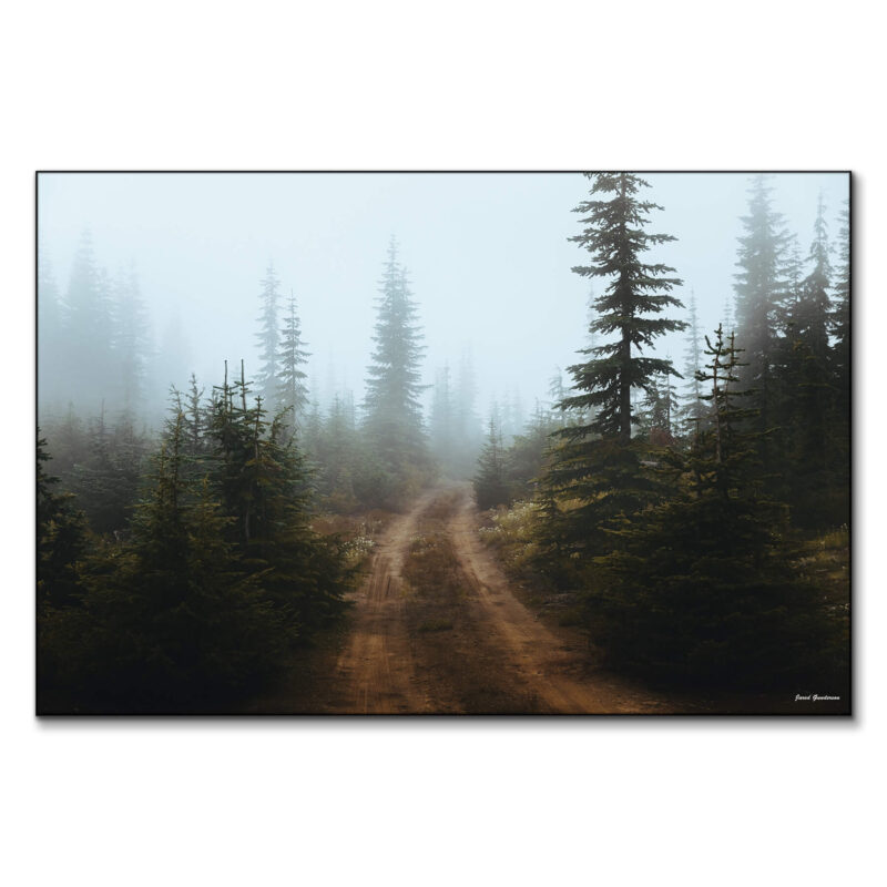
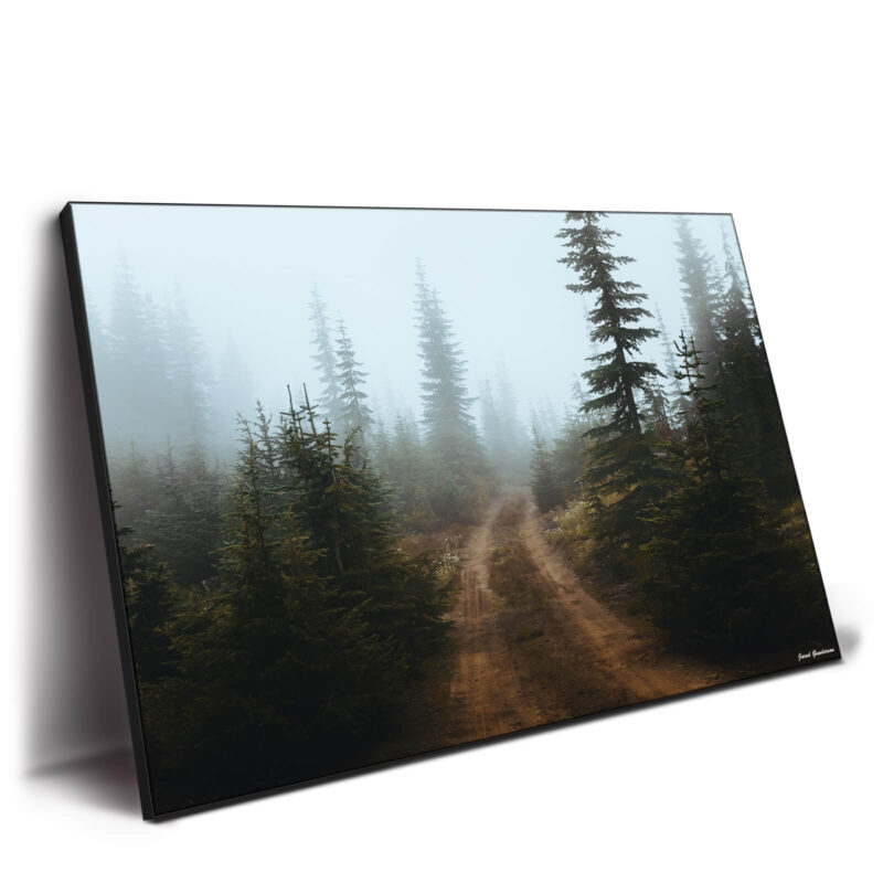
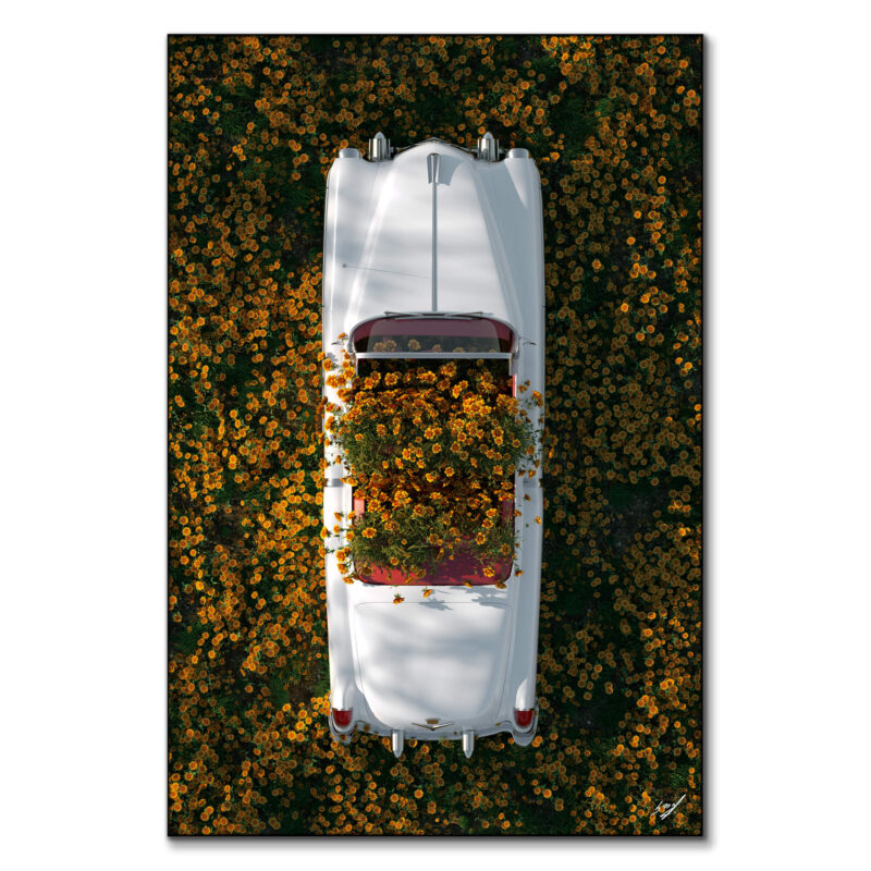
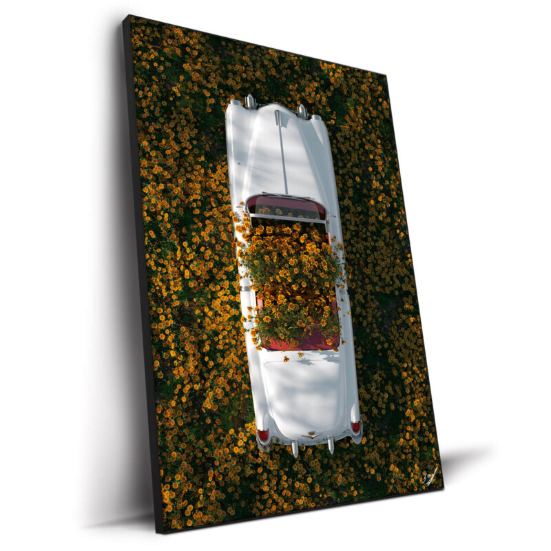
Skip the pumpkin parade. You want fall wall decor that feels designed, not themed. Think oversized landscapes in sepia greens and smoky browns (like Road to Nowhere), abstract fields with rust and clay undertones (like Sky Landscape ), or vintage-coded florals scaled up (like Garden of Eden VIII). Bring in a chunky knit throw, a textured rug, and ceramic vessels. The room whispers autumn without screaming decor aisle.
Pro tip: rotate prints, not furniture. With a swappable frame system, you can change the art in seconds and update the mood for the season. No storage unit. No commitment anxiety. Just a fresh chapter on the wall.
More Fall Looks You Might Be Missing
-
Jewel-Tone Accents – Plum, aubergine, mustard as pillows/throws against camel or sand. Pair with a moody abstract (Infinity III) so it feels intentional, not random.
-
Chrome + Clay – Polished nickel/chrome next to terracotta is the 2025 glow-up. Clean, fresh, and very editorial with a black-and-white oversized print Dialectical.
-
Plaster & Stone Texture – Limewash, Roman clay, travertine tables. Keep the palette quiet and let a large minimalist piece Dreamers of Melancholy handle the statement.
-
Subtle Plaid – A check throw or pillow layered under a solid-heavy scheme. Works with vintage-inspired artwork She Saw the Equator without tipping into costume.
Quick Styling Plays
-
Match frame tone to the largest wood element (usually the floor or media unit) for instant cohesion.
-
Use an oversized rug to visually “scale up” the room so a 48×72 or 60×90 doesn’t feel too bold.
-
Style shelves sparingly: stacks of books, one sculptural object, one plant (leave air for the art).
-
If you’re renting, keep walls neutral and switch seasons through textiles and prints.